2020-2021
Pace Gallery
A pitch, an overhaul, and a refresh
These many projects for Twitter were completed as Creative Director for Instrument. This work included so many people at Instrument, Twitter, and many agencies around the world. Notably L’atelier Irradié’s Alain and Laurent Vonck provided the new Twitter brands initial visual direction, Grilli Type created the custom typeface, and The New Company and Death of Bad provide endless inspiration. Our team at Instrument included Sara Merriman, Annie DeYoung, Savannah HolderArietta Tetreault, Anthony Zukofsky, Natalie Miller, Jenny James, Liz Hart, Xi He, Jack De Caluwé, Sage McElroy, Nimi Einstein, Justin Holbrook and so many more.

Background
In 2020 I had the distinct pleasure to work deeply with one of the worlds most powerful, humble, and exiting brands. Twitter came to us in late 2019 with a nascent brand refresh. Literally a few slides of brilliant visual work by l’atelier Iraradié. Consisting of a few motion studies and mock-ups of outdoor campaigns, the work reflected Twitter’s newly articulated brand personality: real, straightforward, and unfiltered. It took the form of print design; halftones, ripped edges, overprinting, collage, misregirstration. Everything we knew from letterpress class and all the dust and scratches we chased in early photshop work in the early aughts. In addition to the ephemeral nature, Grilli Type was commissioned for a special cut of their wide ranging gothic, GT America. But could this feeling be translated into the digital world? That was our remit.
Tweet Forward
Our task to a proper digital system for ease of use across dozens of properies and multiple authors around the world while at the same time embracing the choas and messiness of the visual brand development. Answers are always easy to see in retropsect, but we did not know how integral our work would be to defining the new brand language. After several rounds of “pressure-testing” (building hypothetical digital experiences that used the brand visual identity) we honed in on what makes Twitter unique: words, tweets.
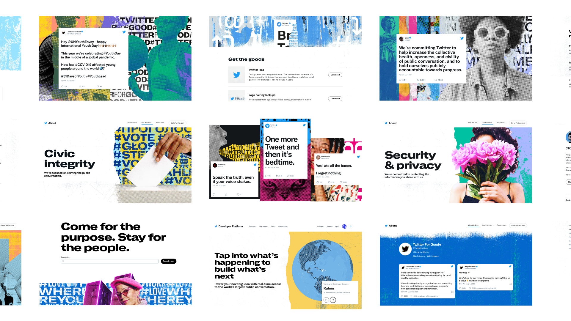
fig11.3
Variety of components from About.twitter.com, Careers.twitter.com, and Developer.twitter.com design, development, and illustration by Instrument including Anthony Zukofsky, Xi He, Savannah Holder, Arietta Tetreault and more
Collaborating in 2020
Adding to Twitter's Web Design System is easy enough, deciding what to add (and when to launch) is a more difficult task in the year 2020. The twin challenges of adding a font upgrade (a switch from Helvetica to our new custom typeface across all components) as well as adding new and dynamic and interactive components were made even more challenging by the year that was. After a handful of in-person meetings in San Francisco in very early 2020, we worked remotely, the first time for many of us, for the rest of our time. Across the country and around the world we held creative sessions and honest critiques during the most powerful protests for racial justice, asphyxiating wildfire smoke in the Western U.S., and a presidential election that was far from certain. Our work was split between design and dashboards of showing Covid-19 rates, electoral maps, and fire containment.
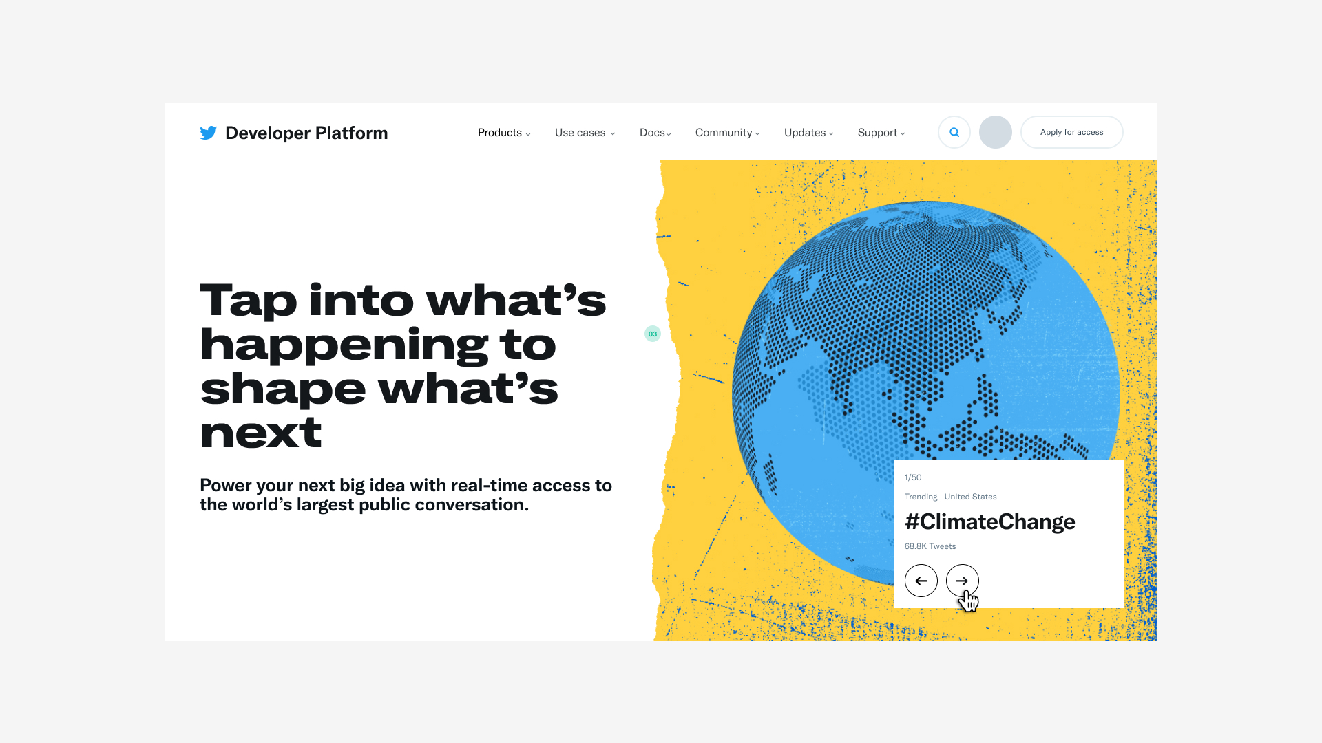
fig11.3
Still from Devloper.twitter.com designed and developed by Instrument including Anthony Zukofsky, Xi He, Natalie Miller and more
Discover = Vision = Pressure-testing
Where the original brand refresh was conceived as an outdoor campaign. It was absolutely lovely, but Twitter is a digital organization. So could it live digitally? We asked this question through making. Designing & building an expressive internal brand center as a way to pressure test and evolve the brand around textures, rips, tears, halftones and attitude. We partnered to restructure, redesign, and develop about.twitter.com for the launch of the brand refresh. We began before the finalization of the new brand guidelines in order to continue to pressure test the new design system.
Visual identity to IA and SEO
Concurrently we worked with other teams including help.twitter.com to adapt to updated design system as well as improve IA and SEO. We created new, user-focused experiences and explored future feature recommendations to aid in higher self-service success and customer satisfaction. We also partnered with careers.twitter.com to restructure and redesign their site in order to apply the new brand and interrogate the existing content strategy. We created a new user experience around discovery and job list searching as well as the Diversity & Inclusion Report. We then defined art direction, and created production-ready assets for the entire site.
fig11.5
LOREM019
Subbrands and artwork
We continue to work with sub-brands at Twitter to help define their brand strategy as well as their web presence. For the Twitter Developer Platform we created a vision strategy, consolidated several sites, ran research and testing, designed and developed pages and components, and created images for their new brand.

fig11.6
Lorem
Casper’s original illustration style was a lovely antidote to existing NYC Subway advertising. The heavily outlined characters, combined with animals and mythical creatures, made the ads easily recognizable. The challenge was to connect with real people and a diverse audience through forms. Having seen the rise of illustration as a way to soften the image of tech giants as well as using animals or pink/purple skin color to avoid questions of diversity, we knew we had to find another way.
Abbey Lossing's near-paper-cut style and expert color choices were a gateway to more representation. Figures remained anonymous and able to communicate a variety of messages, but fuller body types and ranges of ages and skintones would start to feel natural to the brand, leading to another step forward in marketing.
ZING but make it comfortable
One of Casper’s core brand personality traits was “zing”. A clever and differentiating noun to connote a sense of lightness, surreality, and fun. Early examples of “zing” were quirky: real and cartoon animals, mattress pool floaties, etc. They were fun but did not speak to restorative power of sleep. Like all brand traits it needed to be consistently reevaluated as we began to tell a larger brand story.
Longtime production and creative partner, Stink Studios, helped us create a new way to add surrealism and fun to the more realistic approach to casting and settings that had resonated with our customers.
fig11.9
Loremr
The result was a sleepy, structured, kaleidoscope of different scenes. We had to travel from NYC to Toronto in order to find the diversity of cast we needed to film. We made a myriad of beds in an airplane hanger with four cameras mounted on cranes. Several directors elicited performances concurrently in order to capture hundreds of takes in a two-day shoot. Zane Miller of Stink Studios led a team to edit and expertly coordinate movements to a dramatic effect. Turning 100 bits of film into a world of synchronized sleepers, finally allowed us to tap into the intamacy and variety of this ancient skill in hopes of creating a business category.
fig11.8
Lore
The Result
The data is in!
For more about this experience please get in touch ↗
You might also like...
MoMA—Advertising, Exhibitions, and Brand Stewardship for The Museum of Modern Art.
2009-2012 · Design & Creative Director, In-house
Philz Coffee—The Fastest way to Order the World’s Slowest Cup of Coffee
2017 · Design & Direction, Work & Co.